Introduction
The release of Ethereum 2.0 will marks the beginning of the largest scale proof-of-work to proof-of-stake migration in the crypto-ecosystem. “The Merge” on the Ethereum network was finalized at Block 15537393 on September 15th, 2022, at 1:42:42 EST. The Merge moved Ethereum to a “Proof-of-Stake” (PoS) network, bringing with it a substantial decrease in the amount of energy required to secure the network, as well as a renewed vigor within the community to continue its development far into the future.
With this motivation, the Ethereum Foundation’s Ecosystem Support Program solicited Ethereans of every ilk, including developers, programmers, designers, statisticians, and data engineers, to analyze the data generated by the network both pre- and post-merge. This article is our best attempt at providing insights into the behavior of validators, how they can be effectively tiered, and how those tiers have evolved pre- and post-merge.
Validators are entities economically incentivized to propose and attest to the proper creation of blocks on the network. The prevailing hypothesis is that, as validators actively fulfill their duties, these network participants will have similar, yet discernible patterns in behavior and performance that will hold insights into the health of both the individual validators and the network as a whole. It is the goal of this analysis to establish a foundation for this understanding by examining and visualizing validator behavior using publicly available data from Beaconscan.
Analysis Purpose
We hope to illustrate, at a minimum, the following:
- How the behavior and performance of validators can be generally grouped into a set of interpretable categories to aid in the understanding of said behavior at both a micro- and macro-level
- How said tiers and the distributions of validators within these tiers have changed since The Merge
- How a given validator’s “journey” from tier to tier most commonly occurs
Our analysis and tiering taxonomy is useful for quick summarizations of validator classes which helps with identifying changes in behavior over time, assists with storytelling, and provides a first view into the validator journey, which places these securing nodes along performance paths that indicates whether there is improvement or a deterioration of block proposal output. This exploration also includes reproducible code for visualizations that we’ve used to construct the overall narrative of this article, but were out of focus for the intended discussion. These additional statistics can act as a useful springboard for more nuanced analysis behind validator behavior.
Analysis Summary
At a high level, our exploratory data analysis shows that since our last pre-merge snapshot there has been a marked increase of Tier 1 validators with perfect proposal records, the percentage of slashed validators has decreased and there has been substantial growth in the proportion of new validators in queue waiting for their first-time block.
Our analysis and tiering taxonomy is useful for quick summarizations of validator classes which helps with identifying changes in behavior over time, assists with storytelling, and provides a first view into the validator journey, which places these securing nodes along a performance path that indicates whether there is improvement or a deterioration of block proposal output. This exploration also includes reproducible code for visualizations that were used to construct the overall narrative of this article, but were out of focus for the intended discussion. These additional statistics can act as a useful springboard for more nuanced analysis behind validator behavior.
Procedural Overview
Ethereum was stress testing their implementation of several years of R&D through the Medalla testnet, the most developed of the Ethereum 2.0 testnets. The challenge then, and our challenge now, was to make sense of the data being generated on the network.
We approached this challenge in the following staged procedure:
- We conducted research into validator functionality, including proposals and attestations.
- We then researched how best to characterize the validator functionality given the information on proposals and attestations, in order to create derived variables that provide insight into the validator behavior, such as the Number of Executed Proposals, Number of Skipped Proposals, and the Active Time for the validator on the network.
- We then did a distributional analysis on these various characteristics in order to assess their polarity, to help us inform an initial scoring algorithm that can be used to produce both a Tier and a Score for every validator in the data.
- Finally, we then scored each validator, and used a combination of statistical methodology and ad-hoc visual analysis to determine appropriate cutoffs for various “tiers” of validators.
Our primary data source for this procedure was BeaconScan. We coded up an automated data scraping routine which pulls data directly from BeaconScan and produces a one-row-per-epoch dataset with the characteristics required to make the assessment of validator score for each validator in the data.
It is at this point important to note that it was not immediately clear, at the outset of this work, that tiering validators would both be feasible and would also produce results that are interpretable and actionable. Part of the work involved could effectively be seen as a feasibility study. However, we quickly realized as work progressed that indeed the validator tiering procedure is feasible. Specifically, our clustering had 100% coverage across all validators, leaving no validator unclassified. This quickly illustrated to us that the overall health of the system is good – in particular, most proposers were “perfect” (they never skipped a block). However, as you will see, over time it is common that “perfect” (Tier 1) validators do indeeed slip into Tier 2, as maintaining the perfect record gets more difficult as a function of time. This indicates why the average Tier 2 validator is actually older (on the network longer) than a Tier 1 validator. But as you will soon see, the performance of validators remains very strong, with the proportion of slashed validators actually decreasing as a function of time.
Let’s dive into the results!
Analysis of the Merge Data
Data Source
Our primary data source for this analysis was BeaconScan, which is the primary block explorer application for the Ethereum 2.0 network. Being fully open-source and open-access, we were able to easily scrape the data contained within it, using open-source R packages designed for data scraping. After some data transformations, we’re effectively provided with a per-validator view, with the data needed to assess their performance:
The 11 variables provided from the Beacon Chain block explorer are:
- X1 – The row index of the validator.
- publickey – The public key identifying the validator.
- index – The index number of the validator.
- currentBalance – The current balance, in ETH, of the validator.
- effectiveBalance – The effective balance, in ETH, of the validator.
- proposed – The number of blocks assigned, executed, and skipped by the validator.
- eligibilityEpoch – The epoch number that the validator became eligible.
- activationEpoch – The epoch number that the validator activated.
- exitEpoch – The epoch number that the validator exited.
- withEpoch – Epoch when the validator is eligible to withdraw their funds. This field is not applicable if the validator has not exited.
- slashed – Whether the given validator has been slashed.
A sample of the raw data is shown below within the R analysis environment, the one leveraged to conduct this study.
| X1 | publickey | index | currentBalance | effectiveBalance | proposed | eligibilityEpoch | activationEpoch | exitEpoch | withEpoch | slashed |
| 48544 | 0xb82235….7ba31841 | 56484 | 31.9997 ETH | 32 ETH | 3/1/2 | 6903 | 9331 | — | — | FALSE |
| 69484 | 0x9947cf….6203bedd | 27105 | 31.45777 ETH | 31 ETH | 3/3/0 | 822 | 1793 | — | — | FALSE |
| 24535 | 0x87fab3….4953c560 | 62452 | 32.14669 ETH | 32 ETH | 6/6/0 | 8157 | 10822 | — | — | FALSE |
| 63142 | 0xaa3c60….73f87750 | 17658 | 31.67408 ETH | 31 ETH | 13/12/1 | genesis | genesis | — | — | FALSE |
| 2424 | 0x989fec….61d63aeb | 33369 | 32.44729 ETH | 32 ETH | 10/9/1 | 3300 | 3552 | — | — | FALSE |
To be suitable for analysis, this data required some minor data manipulation of its fields. This included the conversion of text columns to ASCII, the parsing and coercion of the current and effective balance columns into numeric variables, and the separation of the proposed column into three distinct fields for blocks assigned, executed, and skipped. Our analysis of validator behavior will take a top down approach where we will first focus on insights gathered at the network level before examining the behavior of individual nodes. With this at the forefront, we can produce our first analysis, a simple summary table of the centrality and spread statistics of our collected features.
With the above data, we have everything we need to begin constructing our tiering procedure. But to most effectively do so, we first performed an Exploratory Data Analysis on the available data.
Exploratory Data Analysis
Distributional Analysis
First, we take a look at the distribution of the number of proposals assigned to validators. This chart presents a rather interesting distribution, which behaves somewhat like a Poisson distribution (where the average number is in the single digits, and declines, with some outlying validators having upwards of 55 proposals assigned). But, there are noticeable spikes at various values.

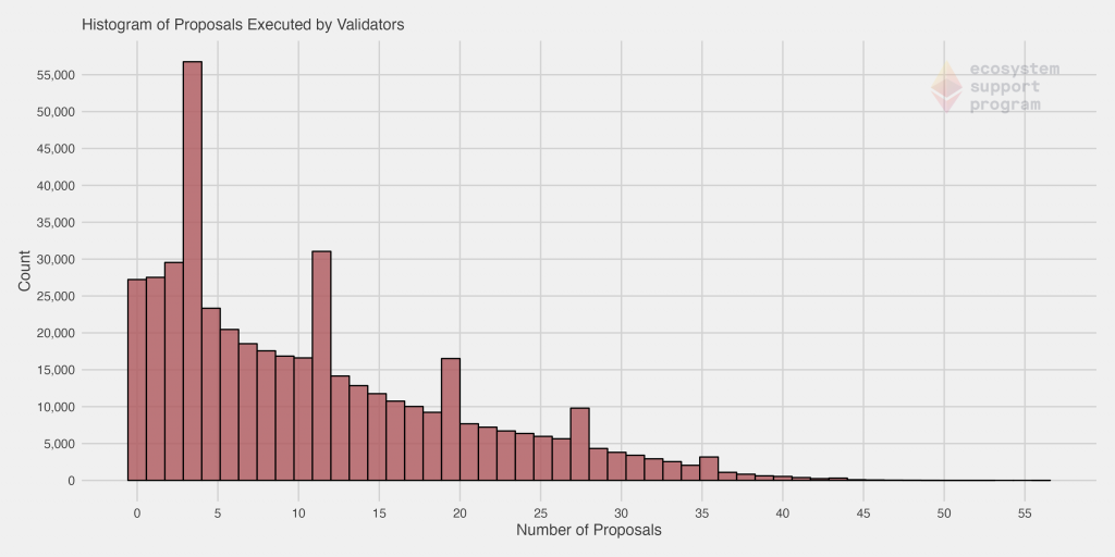
When we specifically look at the proposals successfully executed by validators, it becomes immediately apparent that in general, most validators do their jobs quite well! You’ll notice that the distribution is quite similar. In fact, it’s very difficult to visually discern any differences. This is because the vast majority of assigned blocks are in fact executed.
We’ve removed the validators with no skipped blocks for this next chart, to help illustrate the distribution. Even doing so, we see the majority of the remaining validators skipped only a single block, further evidencing the performance of validators in general. However, you’ll notice the distribution has quite a long tail – in fact, in more extreme cases, some validators have skipped over 30 blocks.

Pre- and Post-Merge Analysis
In the below charts, the pre- and post-merge time frames are highlighted in red and green respectively, to allow for a more seamless visual comparison.
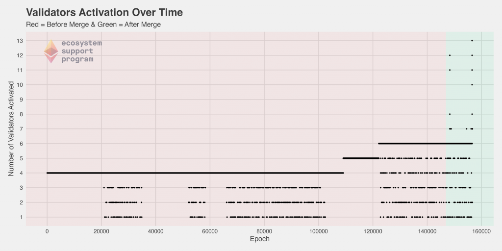
When we look at the number of validators activated as a function of time, we see that pre-merge, the vast majority of epochs had four validators activated. But, as per the specifications of the protocol, https://kb.beaconcha.in/glossary#validator-lifecycle, this number is expected to increase as more validators are added to the platform. We clearly see this occurred pre-merge, quickly rising from four to six between epochs 105,000 and 125,000. Since the merge, that appears to have somewhat consistently been maintained, but we also see for the first time epochs with activated validators upwards of 6… in fact, some as high as 13 in a single epoch!
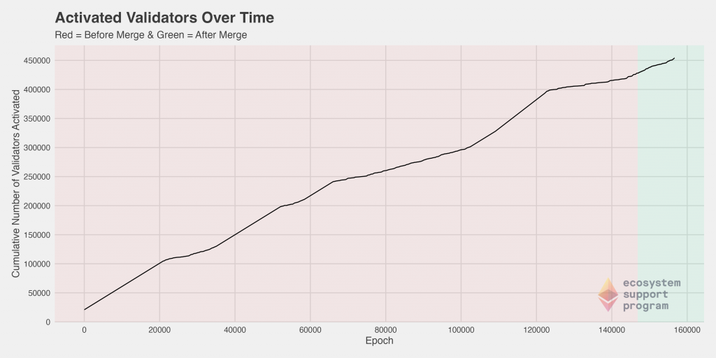
We can also look at this data from a cumulative perspective, which highlights the relative “spikes” (sharper increases in the number of activated validators per epoch). The pre- and post-merge differences do not visually appear extreme, although the slope does increase noticeably post merge compared to the roughly 20,000 epoch period preceding it.
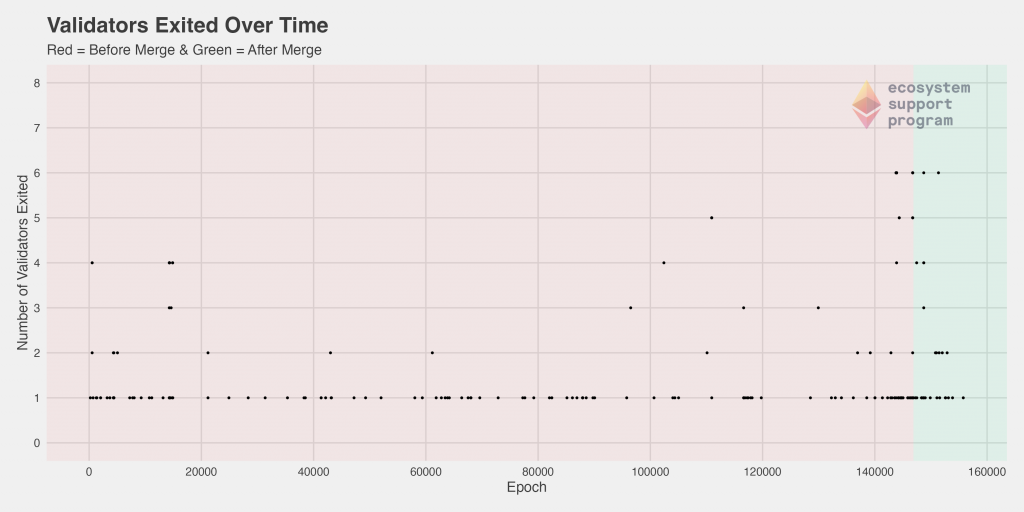
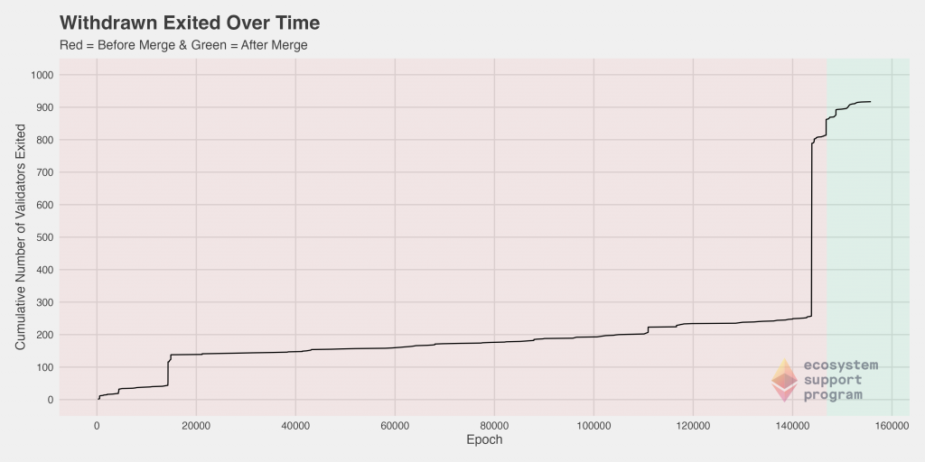
Next, we can look at the number of validators that exited as a function of time, once again coloring the plot to clearly distinguish between the pre- and post-merge periods. Here, we show both the standard and the cumulative plot side-by-side because of the density of the points – While the trend is not immediately clear when looking at the standard plot, viewed cumulatively, we immediately see a significant jump in the number of validators exited just before the merge. We can speculate as to the reasons, but perhaps there was a hedging of bets pre-merged in case of any eventuality, such that some validators felt it safer to exit just prior to the merge.
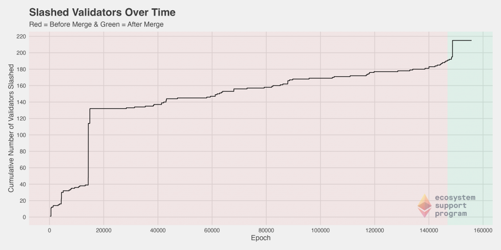
Slashing on the Ethereum 2.0 network is the act of punishing validators for violations of the consensus rules by either improperly proposing a block or failing to properly attest to a block while in an assigned committee. To better understand the slashing behavior within our dataset, we investigated the number of slashed validators over time.
Prior to epoch 20,000, there was a drastic spike in the number of validators slashed. After that point, the rate remained rather consistent, with some minor deviations, between epoch 20,000 and epoch 140,000. Then, before the merge and immediately after, there was an increase followed by another spike. The magnitude of this spike did not approach the magnitude of the one seen previously.
Correlation Analysis
Next, we turn to an analysis of the relationship between pairs of variables. The goal here is to help identify how the correlation between specific features of the validators might help us inform an effective and meaningful tiering of the validators.
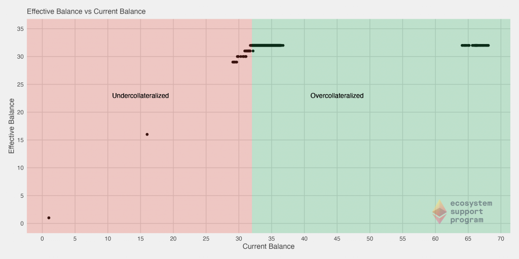
First, we analyze the effective and current balances of the validators to get an idea of how that relationship is most commonly exhibited amongst validators. Here we’ve highlighted the different segments of the chart, specifically those that are overcollaterallized (those with a current balance over the requisite 32 ETH) and those that are undercollateralized (those with a current balance under the requisite 32 ETH). In fact, we see that a large chunk of validators have around 2x the total number of ETH required! Some cautious validators may be managing their balance in that way such that in the eventuality of a penalty, the continue to stay over the required balance.
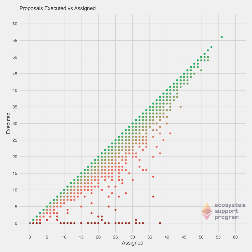
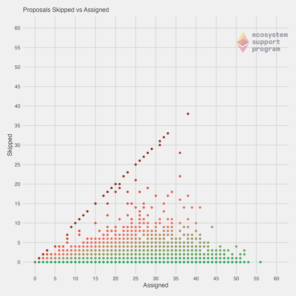
Next, we look at the correlation between both the executed and assigned proposals, as well as the skipped and assigned proposals. On the left, the diagonal line corresponds to those validators that are “perfect” – every proposal they’ve been assigned, they’ve successfully executed. We immediately see that most validators fall somewhat closely to that diagonal line, but there is a trail-off and many others are failing to execute proposals they’ve been assigned. You’ll also notice a handful of validators falling along the bottom of the graph – no matter how many they’ve been assigned, they still haven’t executed any! On the right, the view of skipped vs. assigned tells a similar story, but viewed in an opposite fashion. Now, the diagonal line are those which have not executed any proposals they’ve been assigned, while our more effective validators fall along the bottom of the chart.
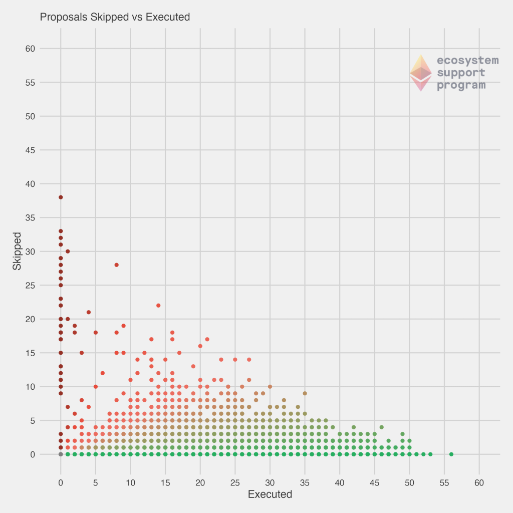
Now, with those charts in mind, we decided to check another pairwise view of this data, by plotting the number of skipped vs executed proposals. In this case, the best validators would fall once again along the $y = 0$ line (bottom of the graph). But, now we begin to motivate some of the scoring procedures developed – a validator that executed 1 proposal, while perfect, has also not had the length of time on the network for us to fully assess his or her performance. Our highest confidence and best validators come for those that are in the far bottom right of the chart. These are validators that have executed a large number of proposals, and skipped none. They are a less common bunch! As you will continue to see, most validators that have been assigned a large number of proposals tend to have some skipped, as this plot helps to make clear.
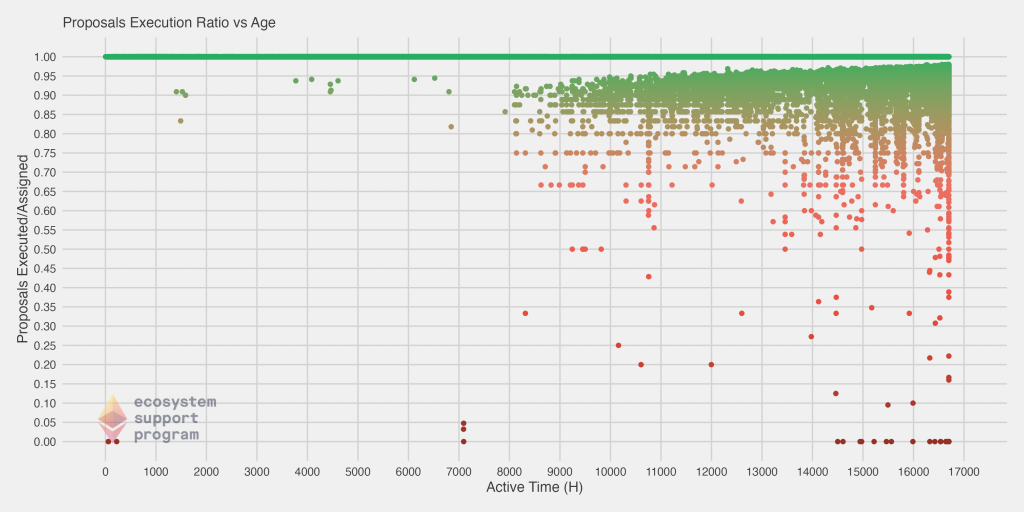
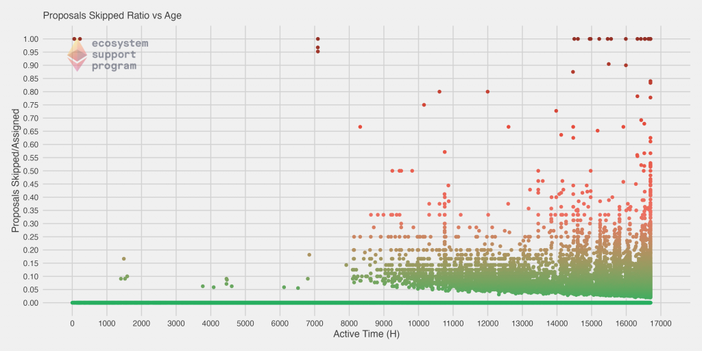
Finally, we have two more plots. In these plots, we show the executed and skipped ratio (dividing each value by the number of proposals assigned) versus the age of the validator. The youngest (newest) validators are on the left of the chart, and the oldest are on the right. One thing to immediately note is that we actually do have a fair number of validators that are in the bottom right of the first chart – that is, they have been on the network a long time, but their ratio of executed blocks is very low (conversely, in the chart on the right, they’d appear in the top right, with a large skipped proportion). However, we see a clear convergence towards a perfect execution rate of 1 for most validators, along with a steady horizontal line for the best validators that have never skipped a block at all.
Data Anomalies
There are a few other interesting facets of the data we identified, which we’re treating more as anomalies /
Now that we have some context for the data that we’re working with, it’s time to turn our attention towards producing a tier list for validators, and scoring them accordingly!
Tiering Validators
Deriving the Ranks
It is our goal at this junction to develop a categorization method that can codify patterns in validator behavior, characterize them and, lastly, provide a metric to discern the difference between constructive and destructive network actions. To facilitate the discovery of these behavioral patterns, and fulfill the aforementioned objectives, we will employ a weighted linear rank scoring algorithm. This simple, yet powerful sorting technique creates a mapping from a validator’s characteristic vector onto a scalar ranked score that can then be used for ordered comparisons between nodes. As inputs into the scoring function, we’ll use the current balance, number of successful executions, the active status of the validator, how long the node has been active, the number of skipped assignments and a binary indicator for whether the node has been slashed. For linear scoring functions to operate properly, the effect of each variable on performance must be well understood and parameterized as polarities. In this application, the polarities of each of our variables are unambiguous. Of the six, the only variables that directly indicate negative behavior are the number of skipped slots and whether the validator has been slashed. To account for this, we will set negative weightings on those two variables and allow the others to maintain their positive polarity.
Here we will formalize our weighted linear rank scoring function. Let’s first define our set of independent behavioral metrics:
$x_1 =$ currentBalance
$x_2 =$ executions
$x_3 =$ skips
$x_4 =$ slashed
$x_5 =$ active
$x_6 =$ active_time
For any specific validator, the ordered rankings of its values on any variable, $x_i$, can be represented as $r_i$. We use weights, $w_i$, to correspond to emphasis placed on variable $x_i$ in the scoring function $S$.
The weight vector shall satisfy the following constraint: $w_1+w_2+w_3+…+w_6 = 1$.
The score, $S$, is then computed as the scalar product of the ranks and weights.
$$S =\sum_{i=1}^6 w_ir_i $$
Once implemented, performance scores were calculated for all validators leveraging each of our behavioral metrics. Our most immediate objective is to visualize the scores to assess how effective they are at differentiating network actors.
Because we immediately found a distinct separation and clustering of various groups, we ultimately used the mathematical derivations to help derive more interpretable clusters which are based on known cut-offs, for purposes of tiering the validators. Doing so allows one to quickly determine the tier of a given validator based on their statistics, and helps in the intuitive understanding of performance that these validators exhibit.
Tiering Framework
After partitioning along the scoring thresholds, we established seven distinct scoring tiers. An investigation into validator performance can now begin on the tier level as a we compare how they each interact with the network. To categorize the behaviors of the tiers succinctly, we’ve listed the mean vectors for each in the table below. Globally, we see a clear monotonic relationship between higher score values and increasingly positive validator behavior. At the tier level, the highest scoring groups have more active validators, have not been slashed, haven’t skipped a slot assignment, have maintained a consistent uptime and have bETH balances larger than 32, suggesting that they’ve been reaping the benefits of their good behavior.
Tier 1: Validators in this set can consider themselves “Proper Proposers” since they are the only nodes on the network with a perfect track record of no skipped slots and no slashings. They often have the highest number of successful blocks to go along with their longer than average active time on the network. 83% of validators can claim membership in this tier, though some have been on the network much longer than others.
Tier 2: Second tier validators are successful in their own right, having consistently executed their duties on behalf of the network, though with a slightly lower number of successful blocks. Only a small number have tallied their first skipped slot assignment. Overall, this group exhibits healthy behavior and represents about 3% of the validator population.
Tier 3: While validators in this tier are still healthy overall, they do have more skipped blocks and slightly fewer successful block proposals. This group has a lower average active time than Tiers 1 and 2. It is in this cluster we observe the first set of inactive validators. Most of the validators on the network fall in this group, suggesting that its members exhibit the most typical validator behavior and perform average, at best. About 6.09% of validators fall into this tier.
Tier 4: This is the tier of validators that effectively represents a brand new validator, one that has not been assigned a block on the network, but has also not been slashed. Validators begin in this tier, before eventually progressing to others. Currently, 6.84% of the validators on the network are in this tier.
Tier 5: – Tier 5 is the first of the truly unhealthy groups where the the ratio of skipped blocks to successful proposals is skewed negatively towards missed assignments. In this tier, more validators have experienced a slashing and the number of inactive nodes continues to increase. 0.57% of the validators on the network exhibit these behaviors.
Tier 6: Validators in this tier are arguably the most toxic, having skipped more block assignments than they have successfully proposed, yet have managed to be on and stay on the network for the longest period of time. These nodes are constantly in danger of being removed from the network due for carrying balances below the 32 ETH threshold. There are a significant number of validators that have been slashed that reside in this group as well. This block represents roughly 0.02% of the network and consists of either improperly configure nodes or bad actors that consistently skip blocks.
Tier 7: The vast majority of validators in this bottom tier are inactive and have had their proposals slashed at least once. There are also a few that left due to an insufficient balance as a result of a disproportionate number of skipped blocks. This group has a low current balance and account for 0.05% of the network.
The averages across the discussed variables are displayed in the table below. One thing to note is that the proportion / count of validators within each tier has changed from our previous iteration of this analysis. Validators have gotten overall better – the proportion of Tier 1 validators, for example, has increased from 82.7% to 83.4%. LIkewise, the number of Tier 7 (slashed) validators has been cut in half. Overall, broadly speaking the percentages are similar, but this tells the story of sustained good performance (and even some improvement).

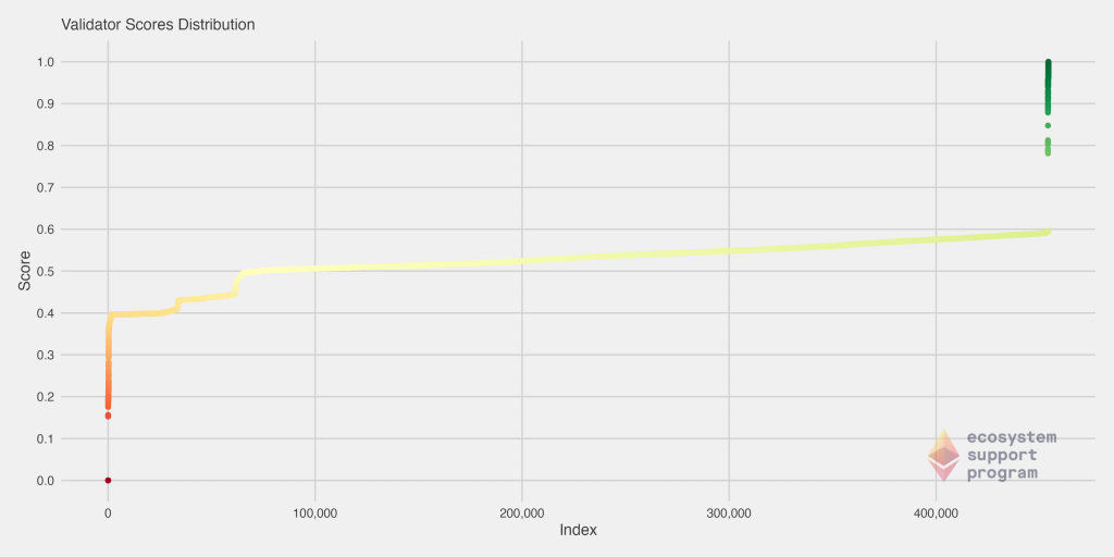
We can also visualize the distribution of scores across all validators. This immediately illustrates to us that there are two very heavy tails – the very best and the very worst validators – while the “average” validators form a tier in the middle with scores ranging from about 0.4 to 0.6.
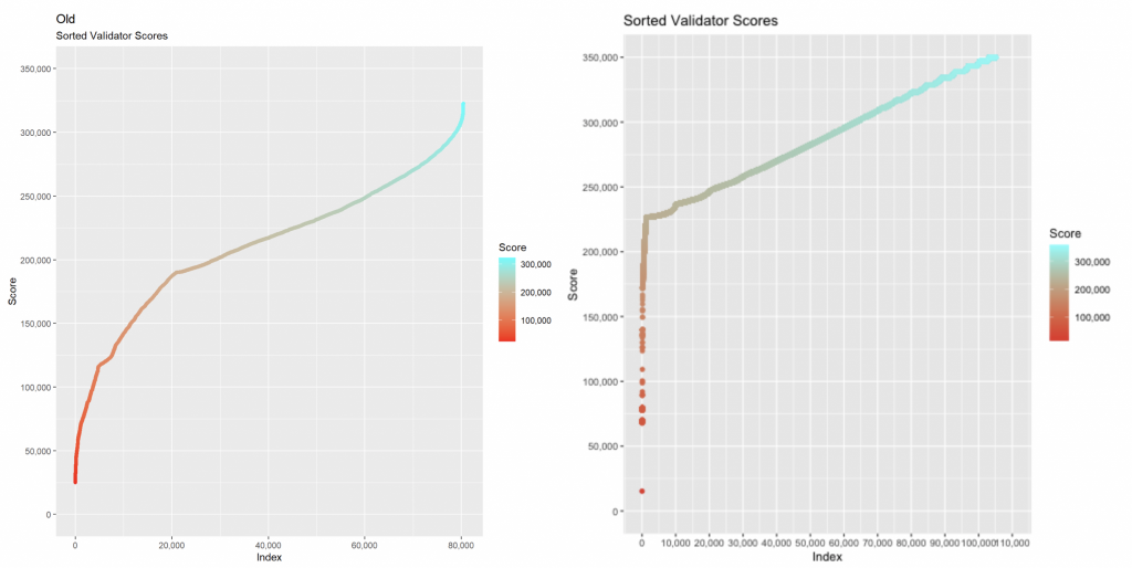
We can directly compare to both the Medalla (left) and the previous validator score distribution (right) by looking at the two previous charts below. We see the continuation of a pattern that began emerging then, where the distribution is less smooth and continuous, and instead (particularly the worst validators) have an abruptly sharp score decline. Interestingly, we didn’t previously see this on the upper-end of the scores. Note also that in our previous iteration of this analysis, we did not scale the scores to be between 0 and 1, but the overall distribution can still be directly compared.
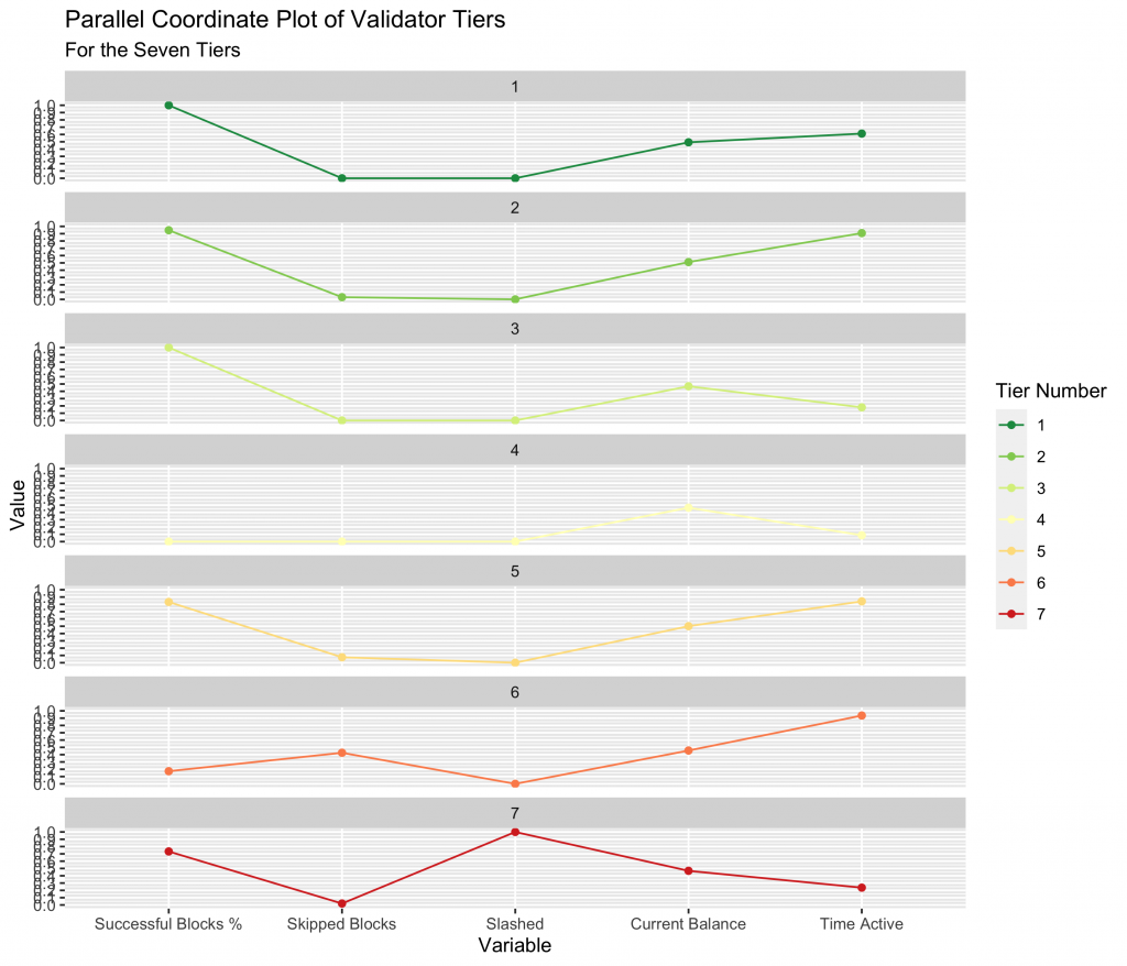
We can look at each tier individually by observing a Parallel Coordinate Plot (PCP) of each validator tier across the variables that went into the model. We converted the number of executed blocks divided by the total assigned blocks to be the Successful Blocks %, to help better visualize the tiers. We immediately see a distinct similarity between tiers 1 and 2, where tier 2 mains a slightly lower success percentage. We see the distinguishing feature of tier 4, which is no successfully executed blocks (yet). We then see the relatively poor performance of tiers 5 and 6, as well as 7 where the primary characteristic is having been slashed.
One important detail to note is that the tier of a validator is not statistic as a function of time. When performing this analysis over time, validators can follow several tier paths as a function of time, as we outline in the four animations below. All validators start at tier 4, before they have been assigned a block, but the path from there varies.
- In an ideal scenario, a validator begins at tier 4, then moves to tier 3 when the receive their first block. At this point, if they receive and successfully execute further blocks, they immediately move up to tier 1, reserved only for validators with a perfect success rate.
- A validator may follow the same path as #1, but later move to a lower tier – in this example, a validator that later misses a block after first achieving a perfect rate on two or more blocks, moves down to tier 2. This is a very common path for many validators, especially those who have been on the network for a very long time.
- A validator may immediate get slashed. In this path, they drop straight from tier 4 to tier 7 and remain there.
- In the path that we’re highlighting as somewhat of a redemption ark, a validator may miss their first block, sending them to tier 6. However, with repeated good performance in executing later blocks, they can move up to tier 5, and over time, tier 2 if the performance continues.
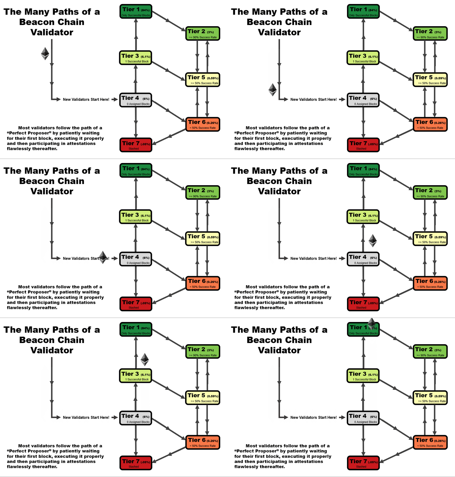
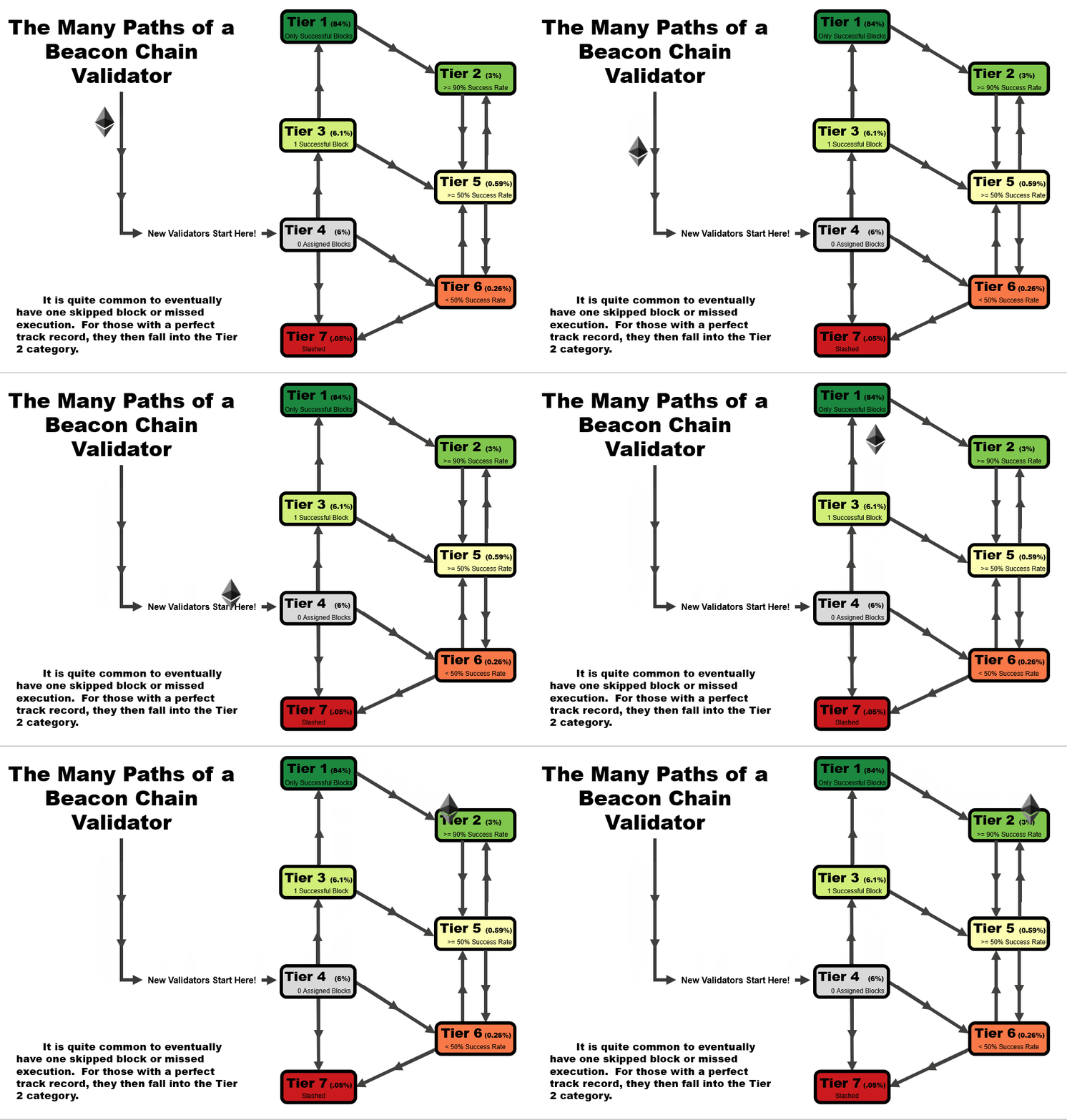
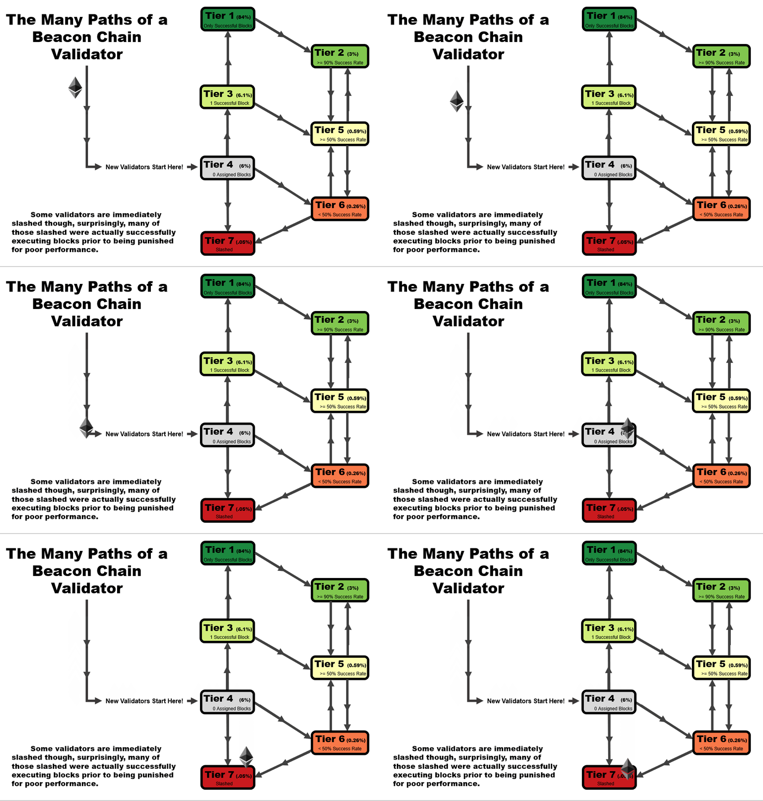
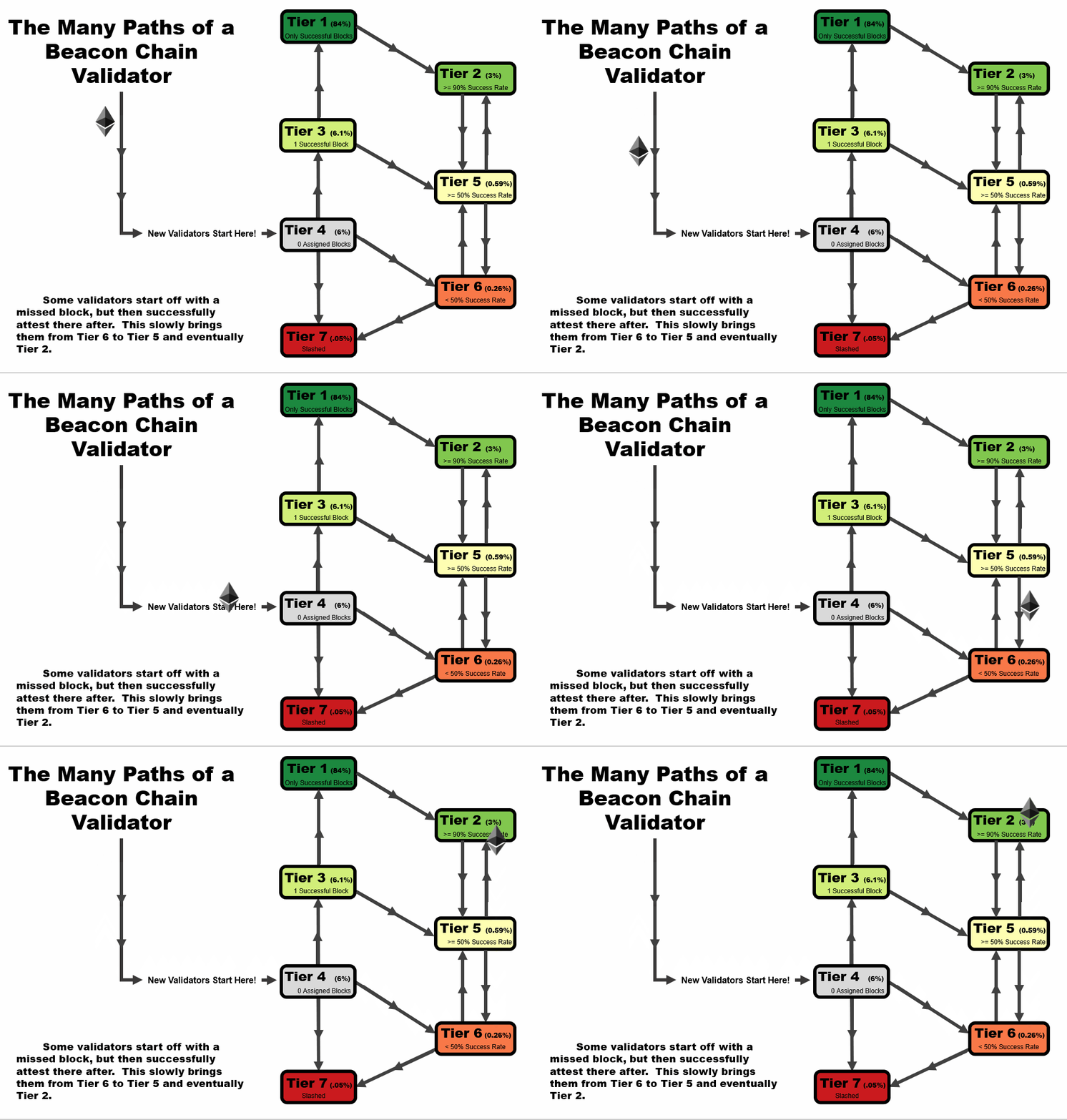
In general, you will note that there are two general trajectories – straight up is the ideal path, leading a validator to tier 1 (or tier 2, if a block had been missed previously). Straight down is the bad path, leading a validator towards tier 6, or eventually to potentially get slashed.
Conclusion
Ultimately, we believe our analysis illustrates the typical characteristics of good, average, and poor validators on the network. We’ve shown how some of these characteristics have changed and evolved post-merge, and used them to create a set of tiers that reflect the current state of the network.
Some of our key findings include:
- Validators are overall performing their duties extremely well, with about 84% of all validators achieving a tier 1 (perfect execution rate).
- Though most variable correlations are as expected, the outlying validators indicate that a sizeable portion of the network of validators have both been on the network for a long time, but also failed to execute their proposals successfully
- Validators appear to be overall improving their performance as a function of time, with the proportion of slashed validators declining and the proportion of tier 1 validators increasing.
We believe this work has a number of benefits to the broader Ethereum community. In particular, validators can see the relative performance expected based on that which has been seen in the past, as well as the typical amount of time it takes to be assigned their first block. Likewise, if blocks are only skipped, something is misconfigured and needs to be updated accordingly. Our tiers can be used to give an indication as to the node performance and how and when it can be expected that performance will be increased to standards that would improve the assigned tier.
In addition, network stalwarts now have clear insights into each group in order to get a feel for the overall health of the chain. For example, an increase in tier 4 validators implies a general growth in the network, which would be seen as a good thing. An increase in tier 7 naturally would be bad, implying more slashings as a function of the number of validators.
There are several potential extensions to this research, including:
- Add new variables to the ranking system to better delineate between tiers of validators
- Explore more robust and intelligent clustering options to help separate the various validators
- Automate this analysis to avoid the need for manual definitions of tier cutoffs and data procurement
Thank you all for reading, and we hope you enjoyed the analysis. If you have any questions or comments, don’t hesitate to send them our way!
References
- Medalla Data Challenge [https://ethereum.org/en/eth2/get-involved/medalla-data-challenge/]
- Medalla Data Challenge Wishlist [https://www.notion.so/Wishlist-The-Eth2-Medalla-Data-Challenge-69fe10ffe83748bc87faa0e2586ba857]
- Ethereum 2.0 Beacon Chain Explorer [beaconscan.com/]
- Consensys Glossary of Ethereum 2.0 Terms [https://consensys.net/knowledge-base/ethereum-2/glossary/]
- Breaking Down ETH 2.0 – Sharding Explained [https://academy.ivanontech.com/blog/breaking-down-eth-2-0-sharding-explained]
- Rewards and Penalties on Ethereum 2.0 [Phase 0] [https://codefi.consensys.net/blog/rewards-and-penalties-on-ethereum-20-phase-0]
- Ethereum 2.0 Explained | Part II | Phase 0 and the Beacon Chain [https://youtu.be/-qwSAFcicg8]
